
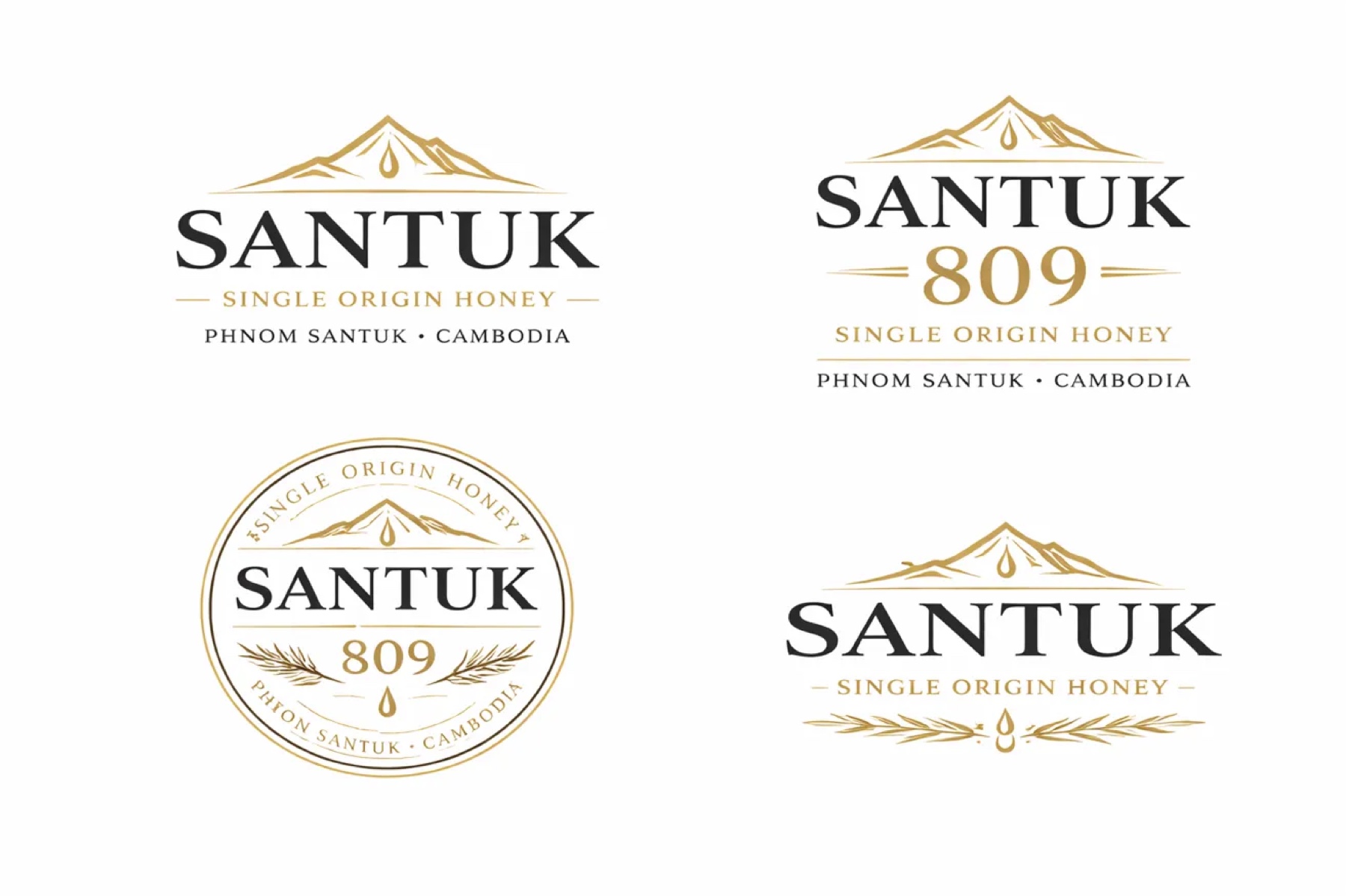
A Logo Is Five Files, Not One
A mark that only works at presentation size is not finished. The deliverable is a system: primary, secondary, seal, monochrome, and micro, each tested where it will actually be used.
A logo presented as a single artwork on a slide has not been tested. It has been staged. The environments that break marks are the ones nobody looks at during approval: a 32 pixel favicon, an embossed lid, a foil stamp, a social avatar cropped to a circle, and a batch label where the mark shares two centimeters with a QR code.
The deliverable is therefore a system of five variants, each with a defined job.
The five required variants
Primary logo. The full lockup: icon, wordmark, and supporting line stacked in fixed relationships. This is the jar front label, the gift box, and the website hero. It is also the version that gets shown in the pitch and the version least often used in practice.
Secondary logo. Wordmark alone or icon alone, compact. Social profiles, email signatures, stickers. The compact version exists because the primary lockup becomes illegible below a certain width, and without a sanctioned alternative someone will simply shrink the primary until it fails.
Seal or stamp. A circular badge treatment. For Santuk that is the wordmark with the 809 heritage numeral and the single-origin descriptor. It goes on the jar lid, a wax seal, an authenticity stamp. The seal is the variant that does the most work in gifting contexts, where the top of the jar is what the recipient sees first.
Monochrome. Every variant in single color, black on white and white on black. This is not a fallback, it is a production requirement. Embossing, foil, screen printing on glass, and single-color shipping cartons all need it, and a mark whose recognizability depends on color is a mark that disappears in half its real applications.
Micro. The wordmark alone, no icon, optimized for the smallest legible use: batch labels, QR page microcopy, lid text.
The tests that matter
Two size tests decide whether the system is finished. Set the mark at 32 pixels and at 16 pixels and look at it on a screen rather than in a design file at zoom. If the icon becomes a smudge, the icon is too detailed. If the wordmark closes up, the letter spacing is too tight for small use and the micro variant needs its own tracking.
Then place every variant in its real context: packaging label, website header, social profile image, email header, business card. A mark that survives all five is done. A mark that only survives three needs another round, and finding that out in the studio costs nothing while finding it out at the printer costs a print run.
Restraint is a production decision, not a taste preference
Premium does not mean dark, and it does not mean expensive to produce. It means intentional contrast and restraint, and the practical test is whether the identity holds up in five years across print and digital.
That leads to a short list of things to avoid: gradients, which shift unpredictably across substrates and reproduce badly at small sizes; palettes with too many colors, which multiply the cost of every print run and dilute recognition; and trendy color choices with visible expiry dates.
Santuk's palette resolves to five values doing distinct jobs. Deep charcoal at 1F1F1F for the dark label background and typography. Warm cream at F4F1E8 for the light label and off-white base. Mountain gold at B28A3E for the logo accent, thin rules, the QR border, and the heritage line. Dark forest green at 2E3A2C for lid options and alternate accents. Amber honey at D79B2C used sparingly, for the 809 numeral and a single drop motif.
Gold appears only in thin lines and single-character accents. Never as a fill, never as a gradient. That restriction is what keeps a gold accent reading as premium rather than as costume jewelry.
Type as hierarchy, not decoration
The typography system runs three roles. A headline serif carrying personality, a neutral and readable body sans, and a clean micro sans for fine print, labels, and legal copy.
Santuk pairs Cormorant Garamond with Inter. The serif communicates heritage and craft, the wine-shelf reference the brand is deliberately borrowing. The sans communicates modern precision, and it is the face carrying batch data, moisture readings, and QR microcopy. The contrast between them creates the hierarchy: the serif says where this came from, the sans proves it.
Every face gets tested at the minimum print and screen sizes before it is locked. A serif that looks refined at 48 point and disintegrates at 6 point on a curved glass label has failed the only test that matters.
Where art direction goes wrong
There are exactly two failure modes and they sit at opposite ends.
The first is copying category codes exactly. The brand becomes competent and invisible, indistinguishable on a shelf from the products it was meant to beat.
The second is differentiating so aggressively that the product reads as amateur or as belonging to a different category entirely. A honey jar that looks like a perfume bottle has not been elevated, it has been miscategorized, and the buyer's first reaction is confusion rather than desire.
Look at the top three brands in the category, then differentiate within that visual language rather than outside it.
The target is a product that a specialty buyer recognizes as belonging on their shelf while looking like the most considered thing on it. That is a narrow band, and it is why the reference set gets defined before the first sketch rather than defended after it.