
Every Premium Brand Needs an Enemy
A brand that stands for everything converts nobody. The most durable consumer brands of the last decade all named something they refused to do, then designed the entire identity around that refusal.
Ask a founder what their brand stands for and you will usually get a list of virtues: quality, authenticity, care, tradition. Ask what it stands against and the room goes quiet. That silence is the strategy problem, because a brand defined only by virtues is indistinguishable from every competitor claiming the same virtues, and there is no version of "quality" that a rival cannot also print.
The brands that broke out of crowded consumer categories in the last decade did the opposite. They named an enemy.
Clean beauty built itself against a specific list of excluded ingredients. Oat milk positioned against dairy incumbency. The pattern is consistent: pick the thing the category does badly, refuse to do it, and let the refusal organize every subsequent decision.
The enemy has to be specific enough to constrain you
A useful enemy is not a mood. It is a rule that costs something to follow.
Santuk's enemy is blending. Cambodian honey is routinely aggregated across provinces, which makes supply flexible and origin claims meaningless. Santuk declares one mountain and one region, and does not blend. That single refusal cascades into everything: it caps supply, it forces batch-level documentation, it makes the harvest window a product attribute rather than a logistics detail, and it rules out the growth strategy of buying volume from wherever it is cheapest this season.
The rule is expensive. That is what makes it credible.
Elephant Cashews has a different enemy, and it is structural rather than technical. Today Cambodian farmers grow the crop, and the nuts cross the border to be processed, branded, and exported by someone else, who captures the premium. The brand refuses that arrangement: processed in Cambodia, packed in Cambodia, branded in Cambodia. Everything else in the identity follows from the refusal.
What a refusal list looks like in practice
Santuk's governance document carries an explicit list of things the brand will never do. It reads as design direction, not marketing:
- No cartoon bees, mascots, or playful brand characters. Ever.
- No medical or health benefit claims.
- No spiritual or mythological language in marketing copy.
- No QR code linking to an empty or inconsistent page.
- No product line extension before the first line is operationally proven.
- No discounting at launch, because price signals quality.
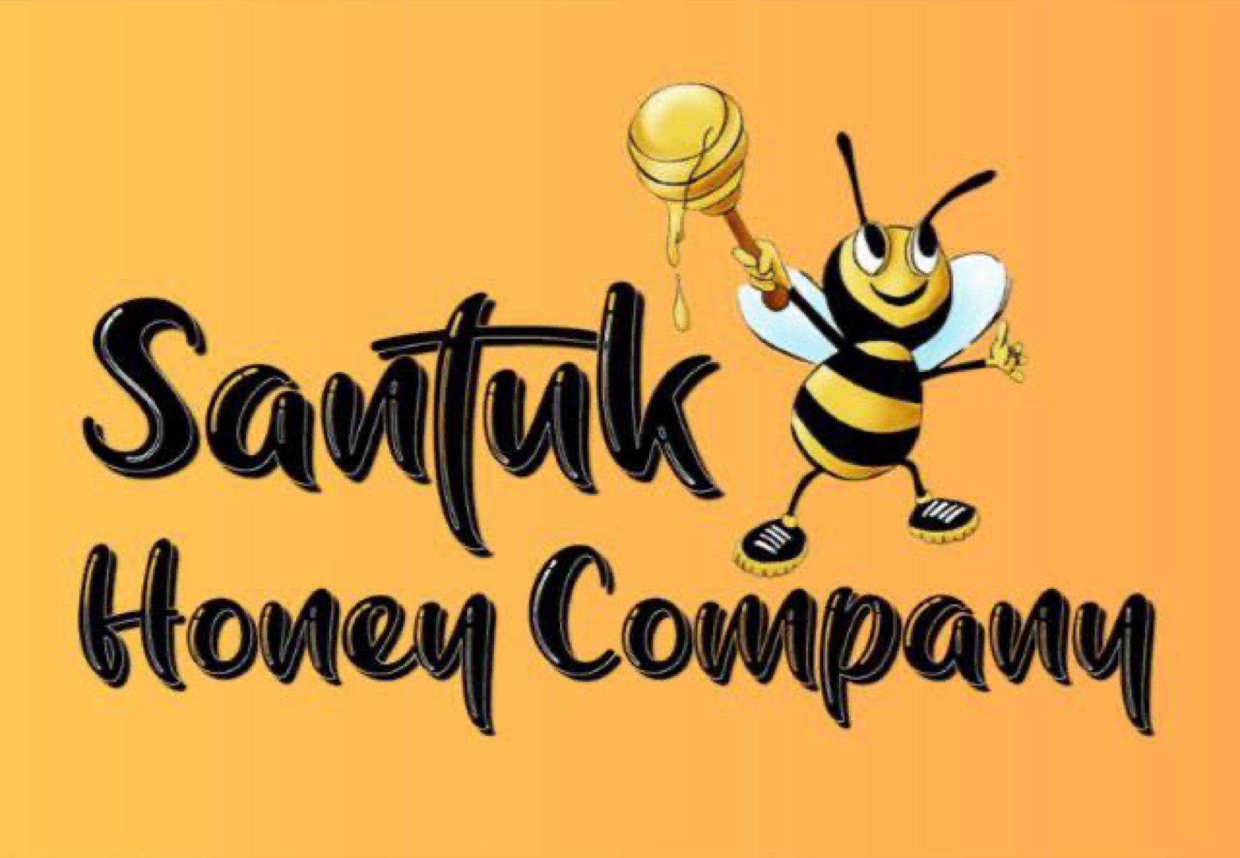
The first item on that list is the most instructive, because it required killing something the client already owned. The previous identity was a cartoon bee holding a honey dipper, set in script lettering on a bright orange field. It was cheerful, competent for what it was, and completely incompatible with a product asking eighteen dollars a jar.
The mascot was not removed because it was ugly. It was removed because a character illustration is the visual grammar of a roadside stall, and the brand was making a terroir argument. You cannot ask for wine-shelf pricing in cartoon dress.
The enemy sets the visual system, not just the copy
Once the refusal is named, the design decisions stop being matters of taste and become matters of consistency.
Santuk's palette bans bright yellow, the default color of the entire honey category, along with gradients of any kind. Gold appears only in thin rules and single-character accents. The permitted motifs are a thin mountain line, a single minimal honey drop, subtle hexagon outlines, and topographic contours. The prohibited motifs are bees in any form, dippers, spoons, cartoon honeycomb fills, and busy background patterns.
That list is only writable because the enemy was defined first. Without it, every one of those decisions would be relitigated at each new packaging run, and the brand would drift back toward category defaults within two years.
Premium is not a price point. It is a standard of operational truth.
Tone of voice is the same decision, applied to sentences
The Santuk voice guide is built as a two-column comparison, and it is the fastest brand-alignment tool we deploy on any engagement.
The brand writes: "Harvested from one mountain." "Batch STK-26-CB-01." "Seasonal. Documented. Traceable." "Cashew blossom, March 2026." "100% honey. Nothing else."
The brand never writes: "Sacred gift from ancient forests." "Nature's golden miracle." "Boosts immunity and vitality." "Pure as the Khmer spirit." "Unlike any honey you have tasted."
Every line in the right-hand column is an unprovable claim, a health assertion with regulatory exposure, or mysticism substituting for fact. The left column is verifiable in an afternoon. Hand both columns to a copywriter who has never seen the brand and they will produce usable work on the first pass.
The test before you commit
Two questions decide whether a candidate enemy is real.
First, does it cost the client something? A refusal with no operational price is a slogan. Blending is cheaper than single-origin. Domestic processing is harder than exporting raw. If refusing the thing is free, the refusal is not a differentiator.
Second, can a competitor adopt it by rewriting their label? If yes, it is not an enemy, it is a claim. Anyone can print "pure." Nobody can print "single origin, batch documented" and survive the first buyer who scans the code.
Get both answers right and the brand has a spine. Every future decision, packaging, campaign, product extension, retail listing, can be tested against it, which is the only reliable defense against a brand slowly turning into all the others on the shelf.