
Label Architecture: Seven Elements, One Fixed Order
A label is read in a specific sequence whether or not it was designed in one. Fixing the hierarchy before the artwork is what separates a premium shelf presence from a crowded one.
A buyer picks up a jar and their eye moves through it in a fixed order, resolving the largest and highest contrast element first, then the next. That sequence happens regardless of what the designer intended. Designing the hierarchy deliberately is the difference between a label that communicates in two seconds and one that has to be studied.
Seven elements, ranked, is the structure we lock before artwork begins.
The order, and why each position is earned
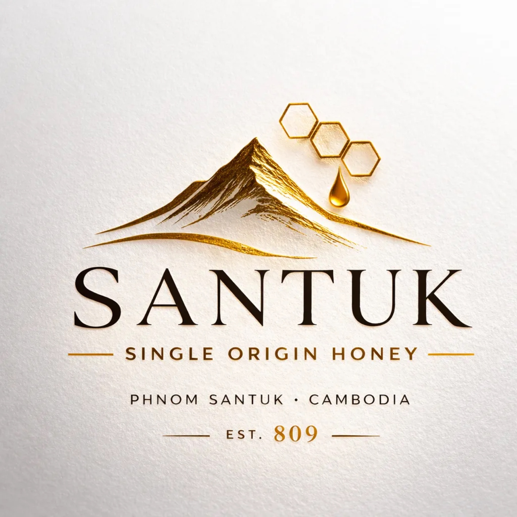
First, the icon. The largest element and the one that carries recognition at distance. For Santuk it is a mountain silhouette with a honey drop motif, thin gold linework rather than illustration. The icon is what a returning customer identifies across a shop before they can read anything.
Second, the brand name. Large serif, dominant. SANTUK set in Cormorant Garamond. The name is second rather than first because at shelf distance the shape of a mark resolves before letterforms do.
Third, the category. SINGLE ORIGIN HONEY in small caps with a thin gold rule on each side. This line answers the question the icon and name raise, and its position is the most commonly wasted on a premium label. Brands frequently spend it on a slogan and leave the customer unsure what is actually in the jar.
Fourth, the origin. PHNOM SANTUK · CAMBODIA, sans serif, spaced caps. The provenance claim in plain declarative form.
Fifth, the heritage mark. EST. 809, with the numeral carrying the amber accent. One accent, one place.
Sixth, the batch ID. STK-26-CB-01, small sans, lower right. The proof layer, deliberately not competing with the brand hierarchy but present on every jar.
Seventh, the QR code. Discreet, lower right, with microcopy reading Scan for Origin.
The last two positions are what most competitors do not have, and they are placed low precisely because they do not need to shout. A buyer who cares about traceability will find them. A buyer who does not is unbothered by them.
Two colorways, two shelves
The same architecture runs in two treatments serving different retail environments.
The charcoal option sets cream and gold type on a 1F1F1F ground. It reads as confident and high shelf, and it is built for export, hotel gifting, and on-shelf retail where surrounding packaging is bright and the darkest object wins attention.
The cream option inverts to charcoal and gold on F4F1E8. It reads as artisanal and approachable, and it performs in specialty food stores and tourist gifting where warmth converts better than gravitas.
Running both is a deliberate decision rather than indecision. The colorway is selected per channel, which means the market decision and the design decision are the same decision, made once.
The back label is where trust is actually transferred
Front labels earn the pick-up. Back labels close the sale for a considered purchase, and they are usually an afterthought filled with legally required text in whatever space remains.
The Santuk back label carries a short origin statement followed by a data block: batch ID, harvest window, region, processing date, packaging date, moisture percentage where tested, ingredients, net weight, best before, and contact. Structured as a list rather than a paragraph, because a buyer comparing two jars is scanning for specifics rather than reading prose.
Every element in that block is also a regulatory requirement in most export markets. Brand name, product name, ingredients, net weight, country of origin, batch identification, best before date, storage instructions, and producer contact details. Designing the data block as a brand asset rather than a compliance obligation means the same square centimeters do both jobs.
Vessel and closure decide the price bracket before the label does
Three jar formats sit on the table for a product in this tier.
A tall cylindrical jar gives a clean silhouette, wraps a label elegantly, works in both colorways, and stacks and ships efficiently. It is the recommended default for that combination of reasons rather than for appearance alone.
A wide-mouth hexagonal jar nods at honeycomb geometry with a heavier base and a more substantial feel in the hand, which suits gift retail at a higher unit cost.
An apothecary or swing-top vessel delivers the most premium impression at the highest cost, and it is reserved for a collector edition or seasonal reserve rather than the core line.
The closure carries more signal per dollar than almost any other component. Matte black on the charcoal label, natural wood or matte gold on the cream. Shiny chrome is excluded, because chrome is the default finish of commodity packaging and it undoes the restraint of everything below it.
Complexity is the enemy of premium execution. If an element adds steps, cost, or copy without adding meaning, challenge it.
The filter applied to every packaging decision
Before any change to a label, a colorway, or a format, four questions run in order.
Is it simpler? Is it provable? Is it consistent, meaning can we do this on every batch, every jar, every time? Is it scalable when volume doubles?
A change that fails any one of them does not proceed. That sounds rigid, and it is, deliberately. Packaging drift is gradual: one seasonal variant, one promotional sticker, one supplier substitution that shifts a color half a step. Individually each is defensible. Collectively, after three years, they produce a brand that no longer looks like itself, and no single decision was ever identifiably the wrong one.