
Product Studio · Brand Showcase
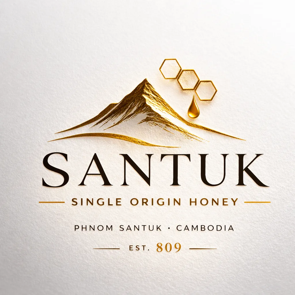
SANTUK
Single Origin Honey
Phnom Santuk · Cambodia · Est. 809
The Transformation
From a Roadside Jar to Cambodia’s Premier Single-Origin Honey.
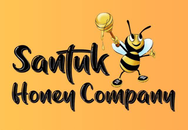
Before · Original Brand
A product with no declared origin, no documented batches, and packaging that competed on shelf presence rather than substance.
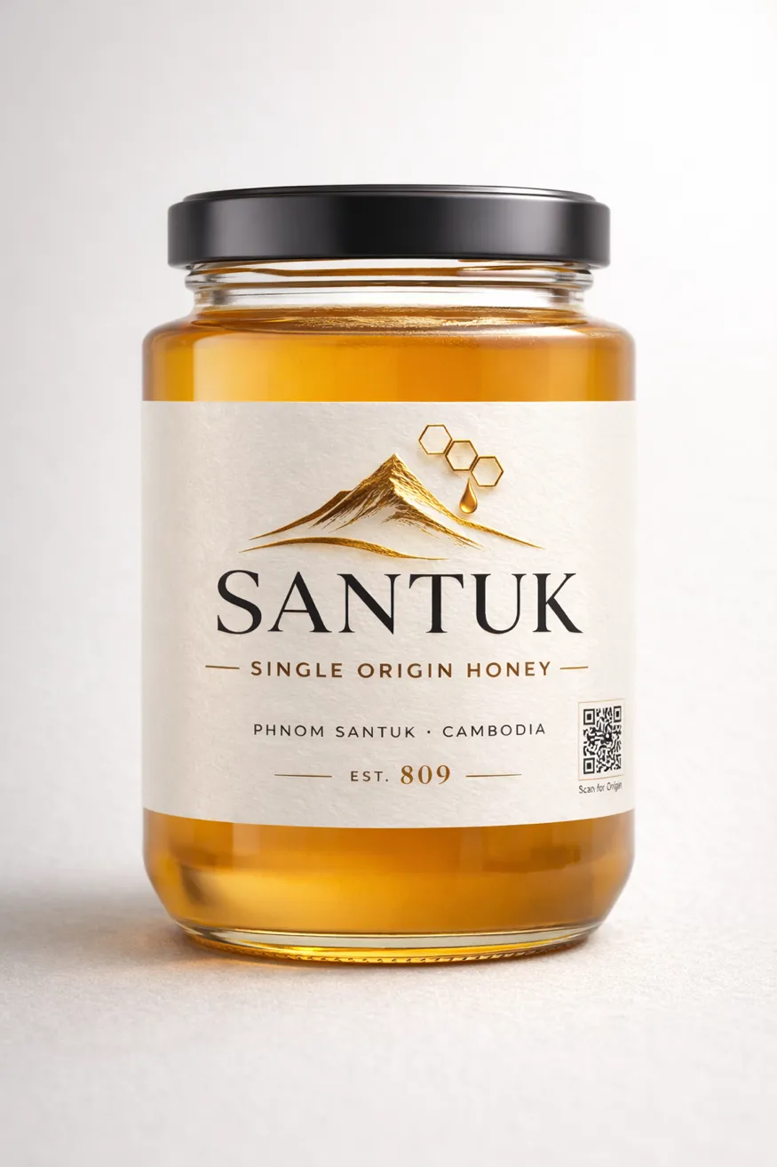
After · Santuk by Imajineer
Cambodia’s first terroir honey brand. Single declared origin. Batch-level QR traceability. Export-ready positioning.
Brand Story
On the slopes of Phnom Santuk, 809 stone steps climb above the plains of Kampong Thom. The mountain’s forests shift with the seasons. Its elevation holds moisture the flatlands do not. During flowering months, cashew trees bloom across the hillsides. Bees move through this environment in rhythm with the climate: clean air, mineral-rich soil, seasonal rain.
Santuk Honey is harvested exclusively from this region. Not blended across provinces. Not industrially extracted. Each batch is documented from hive to jar: harvest window, apiary location, processing date, moisture percentage.
Cambodia had plenty of honey. It had no honey brand. Imajineer built one, on wine logic, not honey marketing.
“One mountain. One harvest. One jar.”
Brand Identity
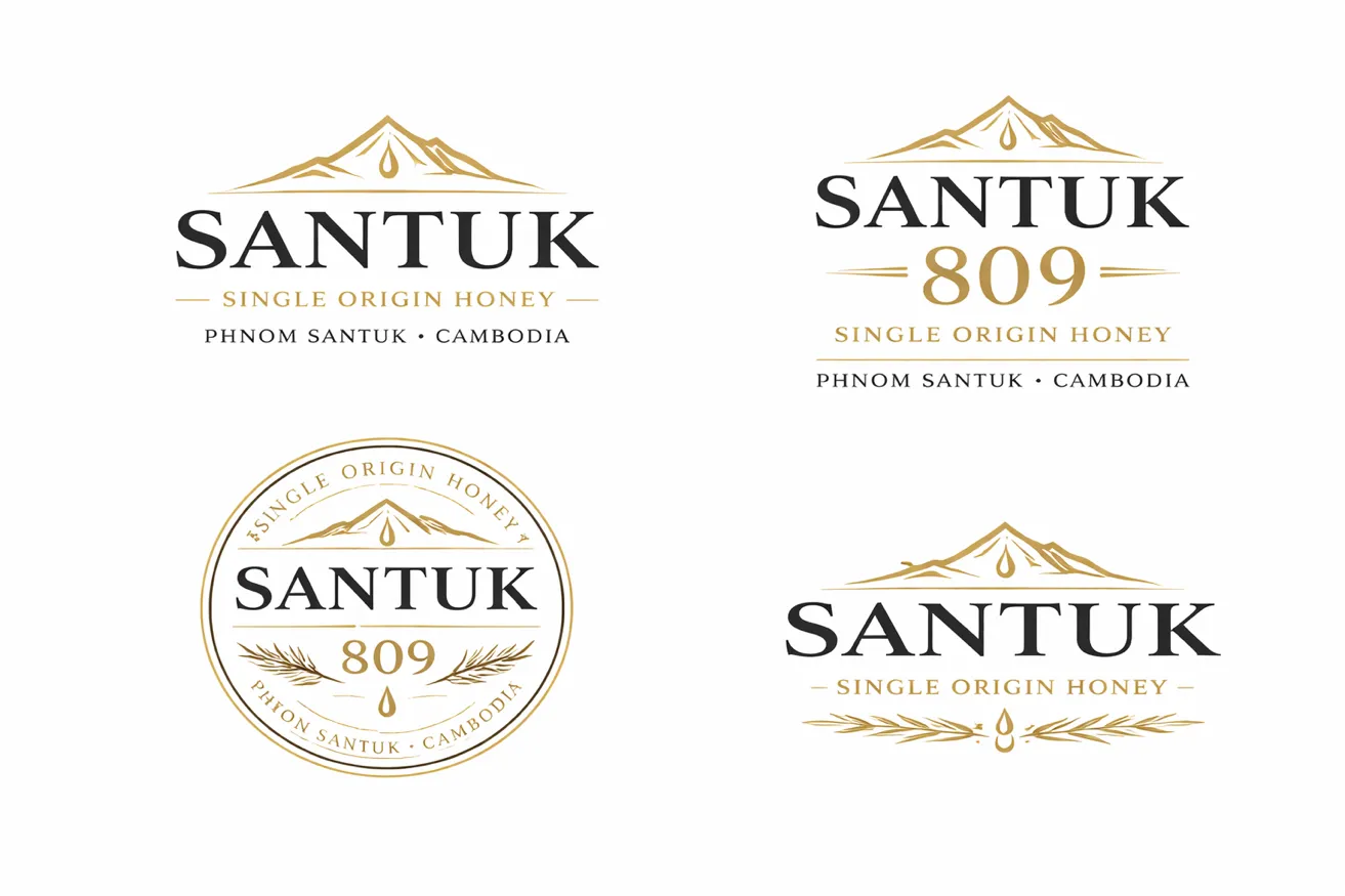
A logo system built for jars, seals, and foil.
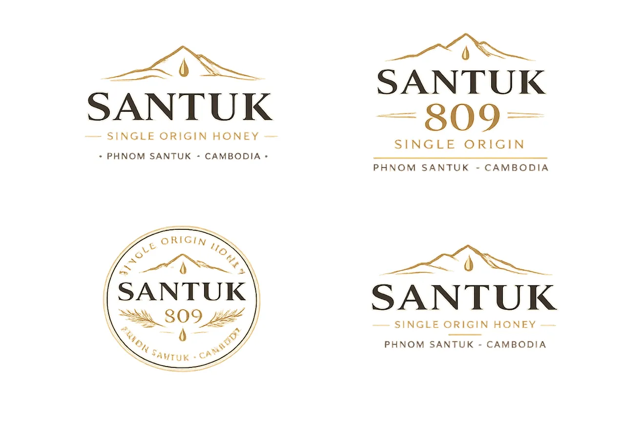
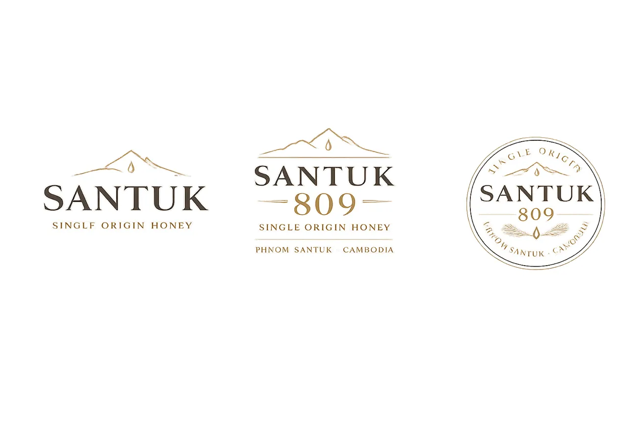
Deep Charcoal
#1F1F1F · Primary
Warm Cream
#F4F1E8 · Primary
Mountain Gold
#B28A3E · Secondary
Dark Forest
#2E3A2C · Secondary
Amber Honey
#D79B2C · Accent
Aa
Cormorant Garamond · Serif
Wordmark, headers, pull quotes. The serif carries heritage and craft.
Aa
Inter · Sans Serif
Body copy, batch data, QR microcopy. The sans carries modern precision and proof.
Packaging
Two colorways. One label hierarchy.
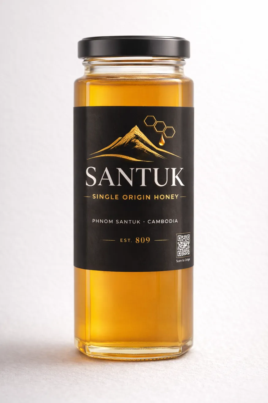
Option A · Charcoal
Confident and high-shelf. Built for export, hotels, and on-shelf retail.
Option B · Cream
Artisanal and warm. Built for specialty food stores and gifting.
Front Label · Element Hierarchy
- 01Mountain + honey drop icon
- 02SANTUK wordmark
- 03SINGLE ORIGIN HONEY
- 04PHNOM SANTUK · CAMBODIA
- 05EST. 809
- 06Batch ID · STK-26-CB-01
- 07QR code · Scan for Origin
The QR System
Every jar has a documented origin.
Santuk operates on the same proof logic as wine. Harvest window, flora source, apiary location, moisture reading, all documented before a jar ships. The QR code on every label links to the full origin record for that batch.
Batch ID Format
STK
Brand
26
Harvest Year
CB
Flora · Cashew Bloom
01
Sequence
Scan for Origin · Batch Verified
Five Brand Pillars
The rules the brand never breaks.
01
Geographic Integrity
One mountain. One region. Not blended across provinces. Never.
02
Seasonal Expression
Honey varies by bloom window. Santuk documents and celebrates that variation, the way wine celebrates the vintage.
03
Traceable Proof
QR and Batch ID on every jar. Every claim verifiable. Every batch linked to a documented origin record.
04
Responsible Harvest
Sustainability is an operational discipline here, not a marketing claim.
05
Cambodian Terroir
The character of this honey belongs to this place.
250g
$12 to $18 USD
500g
$22 to $32 USD
Gift Set · 2 × 250g
$38 to $50 USD
Premium by structure, accessible in price. No discounting on launch.
Deliverable 06
The live Santuk website.
The full brand experience, shipped as a standalone site with its own design system: origin story, traceability, batch archive, and shop.
What Imajineer Delivered
Eight deliverables, one system
01
Brand Positioning & Strategy
Terroir positioning, wine logic applied to honey, and the strategic gap analysis behind it.
02
Brand Naming
SANTUK, named for the mountain. One word, one origin, ownable.
03
Logo System
Five variants: primary, secondary, seal and stamp, monochrome, micro.
04
Packaging Design
Two colorways: charcoal for the export shelf, cream for artisanal retail.
05
QR Batch Traceability
Batch ID format STK-26-CB-01, a scannable origin record on every jar.
06
Website Design & Development
The standalone Santuk site: origin, traceability, batch archive, shop.
07
Copy & Content Framework
Tone of voice rules, approved microcopy, and claims discipline.
08
Go-To-Market Strategy
Local anchor, then regional export, then international flagship. In sequence.
More production work lives in the Animation & Commercial practice.
Commission a brand like this.
One product, one origin, one system of proof. Yours could be next.